Kosmos brand identity
Kosmos is an international innovative electric appliance brand.
The brand’s strategy is mostly oriented to increasing sales in Europe. Our goal is to create a unique, memorable image based on the existing concept. The previous version of the logo required some changes, to refresh the brand.
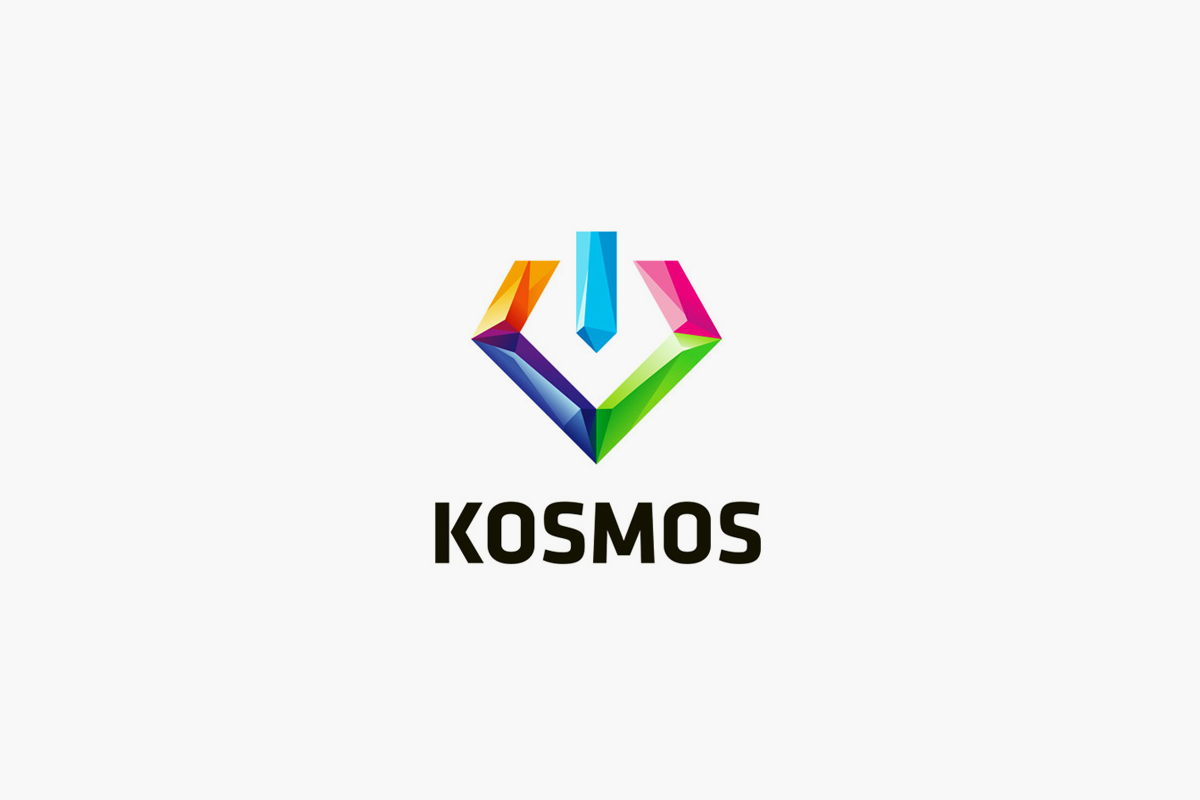
The logo has 5 colors, symbolizing 5 production categories: lamps, lanterns, batteries, light bulbs and electronic devices. We have kept the ‘on’ symbol, which correlates with the “Switch the energy on!” slogan.
The symbol is crystal-shaped, but the graphic style is different now – the shape of the symbol has become cohesive, the fragmentation has gone. The font has been changed, too.
The symbol is crystal-shaped, but the graphic style is different now – the shape of the symbol has become cohesive, the fragmentation has gone. The font has been changed, too.


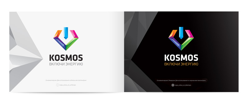
The main version of the logo with its inversion
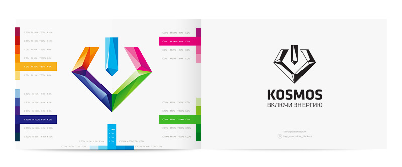
The color scheme of the main graphic element and the logo’s monochromatic alternative
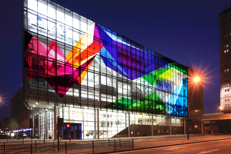
New style inside and outside