Hanzas Perons identity
A modern building with a historical background, that is located in the heart of Riga, hosts cultural events.
We have developed a text logo, standard elements of brand identity, and design mockups for physical elements.
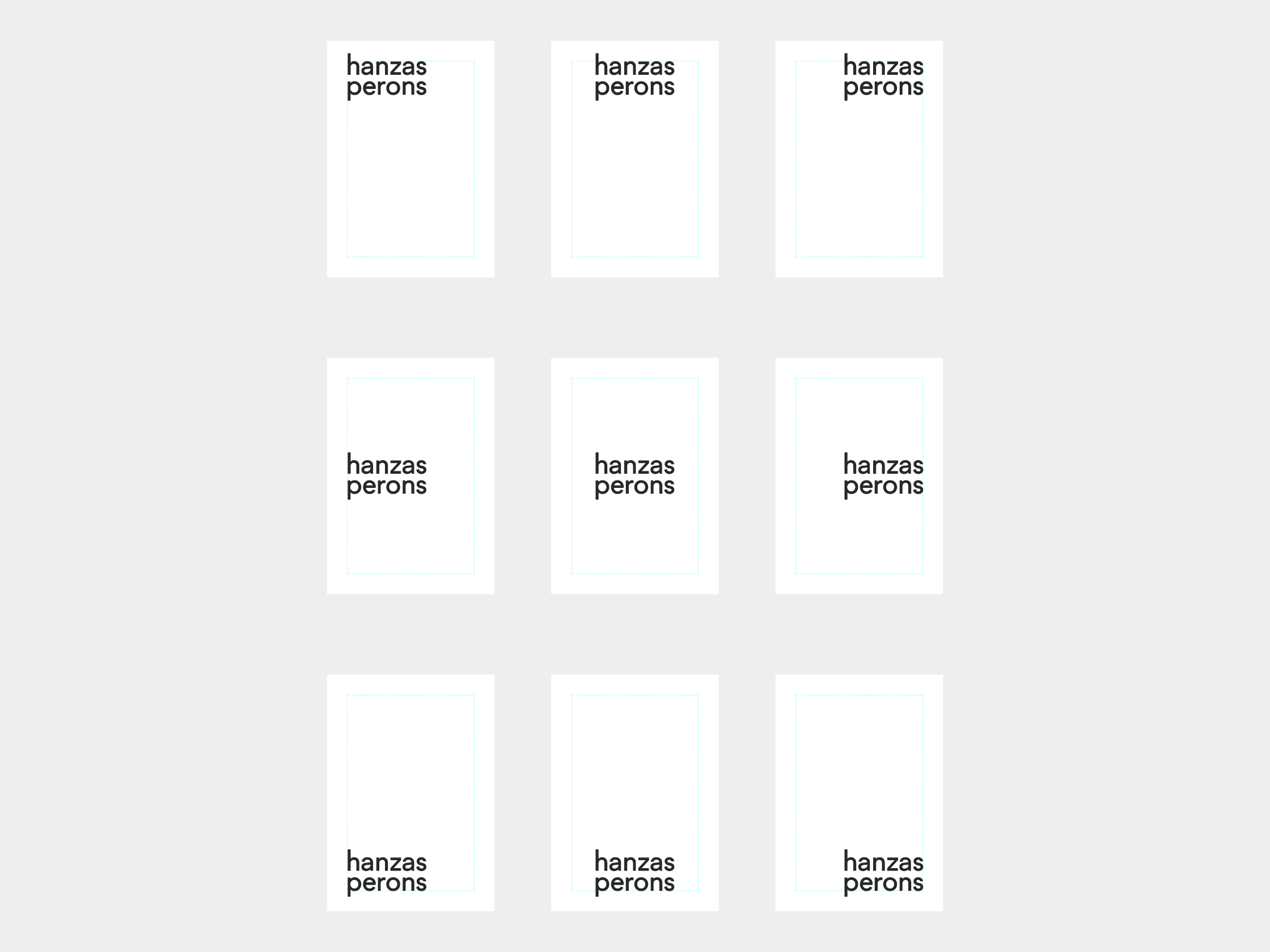
The Grotesk logo is neutral enough to go well with different visual styles. Yet it has character and it is easy to remember.
The Grotesk logo is neutral enough to go well with different visual styles. Yet it has character and it is easy to remember.


In design, normally the logo is not the main point of focus, so the placement principles are as diverse as possible.
We also created a graphic stylization of Hanzas Persons building.


This element is fit for the formats that call for animation, e.g. the landing page (spring—summer 2019).
The design aims at communicating the spirit of the cultural center – the modern building that has a history. To stress that, we paired a geometric Grotesk with a modern Antiqua.

Combining contrasting fonts in one brand style is a common move but it works well and makes Hanzas Persons a recognizable brand in Riga.


We also developed guides and layouts that help to design posts for social media. We have emphasized the background visuals, the text playing a secondary part.
