eCom21 e-commerce forum website
A massive and inspiring event of the year in the field of e-commerce that gathers hundreds of internationally successful market makers, opinion-leaders and the most influential experts of the field.

Sharp, clear, consistent. These are words you think of when go there. There is simply a Suisse stand and two deep colours, red and blue, which became the core of the project.
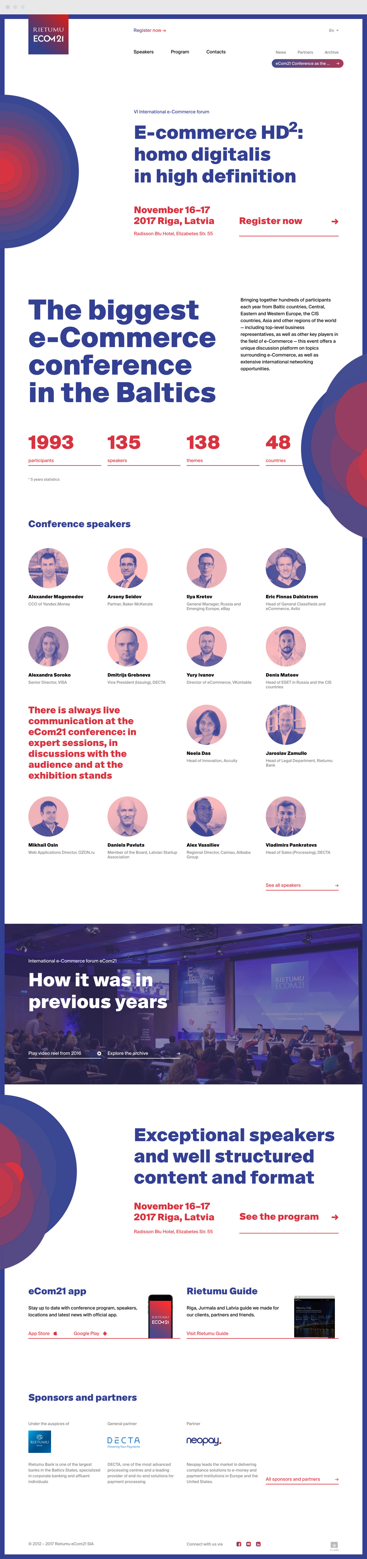
First impression
Each element of the homepage is functional and forms the visual harmony.
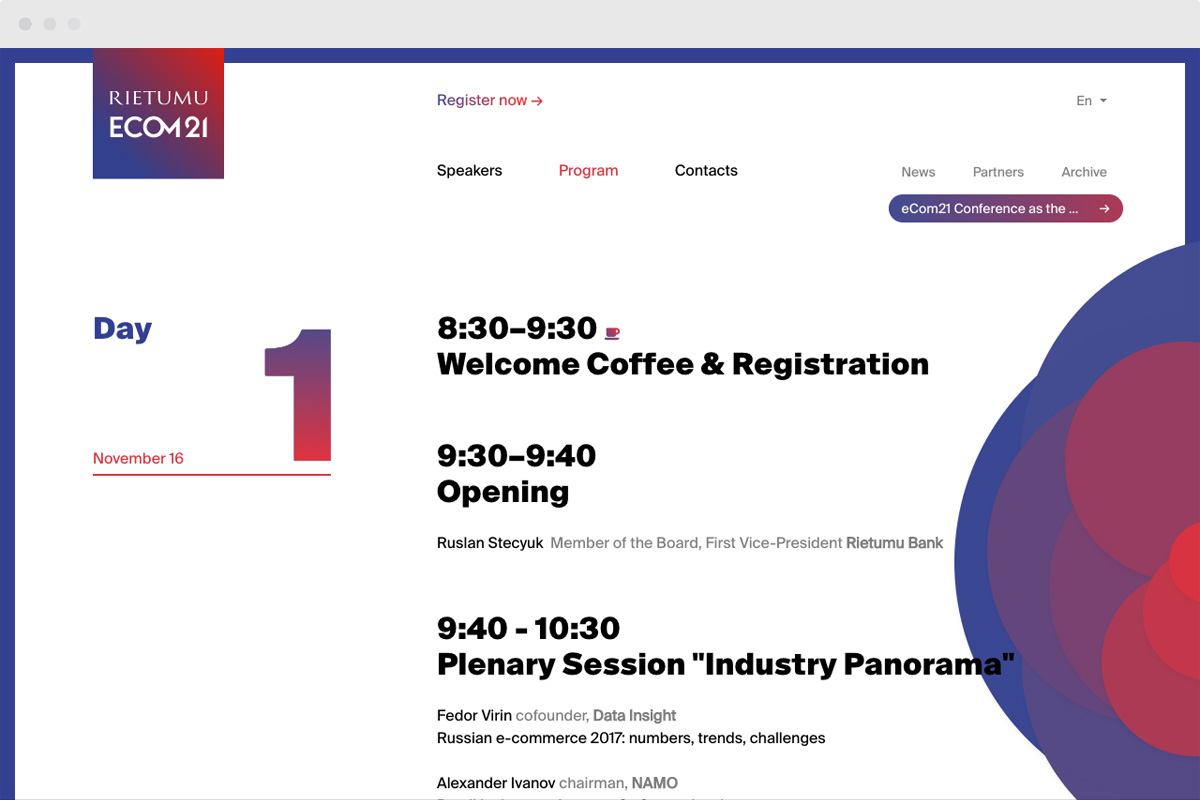
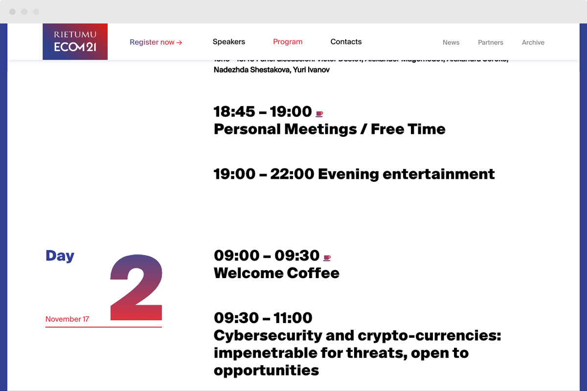
Program
The program lacking complex images is easy to read. The clarifying information is in grey and is distinguished from the main text.
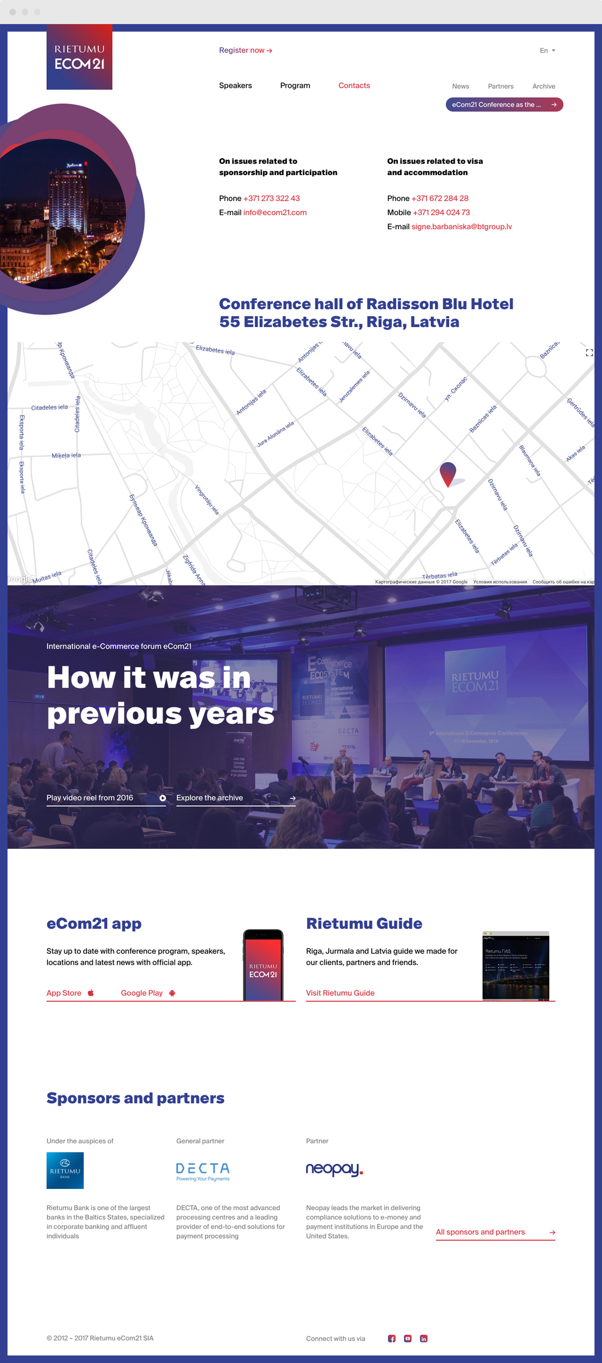
Contacts
The purity is observed on the Contact page too, as it has quite enough visitors to be considered only image-making.
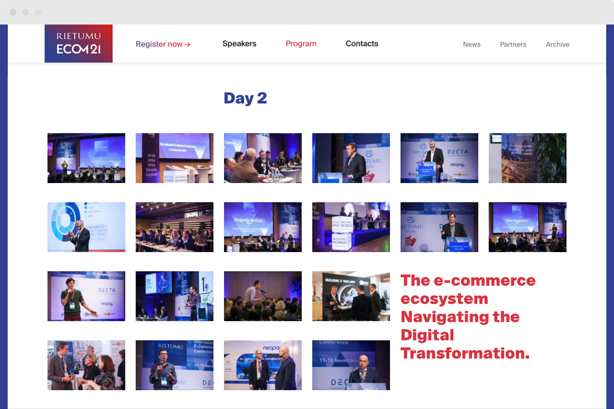
The visual content displays the level of the conference. Therefore, the photo archives were carefully selected, while the text boxes helped not to blend the pictures.

The website of the conference of such level is impossible without adaptive design.
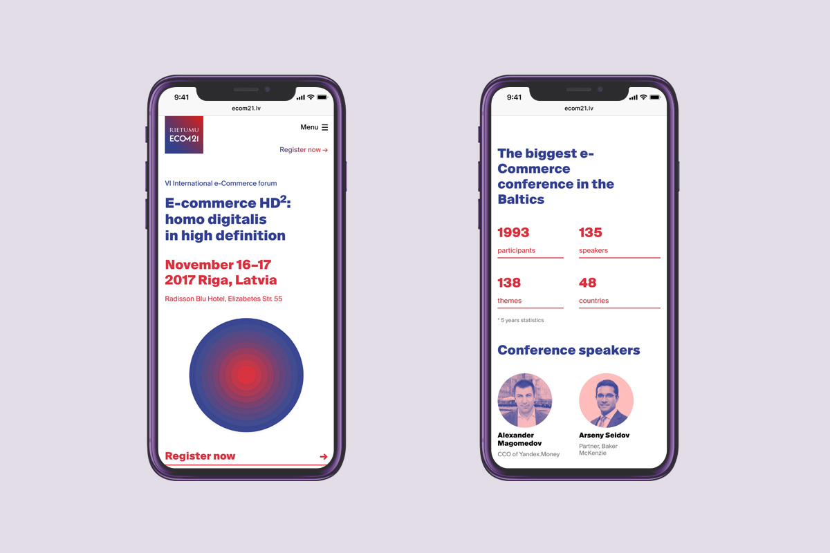

Adaptive design
Having aligned distances and spaces, we have kept the information on each page even for the smallest devices.